Kurt Schwitters
Opened by Customs
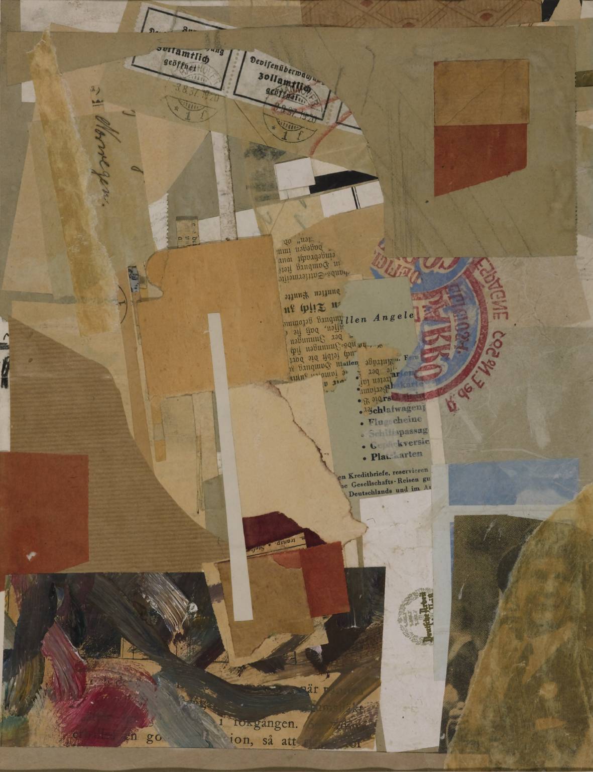
Transcript
Opened by Customs is a complex mesh of overlaid scraps of paper that reflects the nomadic life Schwitters was forced to lead in the late 1930s. It is difficult to decipher the origins of many of the fragments as they have been cut or torn rather roughly from their original source. However some of the pieces have retained a few clues to their origin. There is just enough information in fact for the work to reflect the difficult period in the artist’s life when he was forced to flee Nazi Germany to the relative safety of Norway.
There are a number of elements that appear to have been ‘new’ or at least crisp when they were stuck down and are linked to the administrative business of travel. In the bottom left section of the collage is a very white piece of paper that stands out against the surrounding duller tones. The quality of the paper and the insignia at the top of the page indicates that it is official headed paper. Although the insignia is turned on its side and partially obscured, the words ‘German’ and ‘Work’ are visible within a laurel wreath.
Next to this in the left hand corner is quite a large section of Norwegian text that appears to be taken from a book or pamphlet. The paper is now faded and few words are legible beneath a smudge of oil paint, however, the word ‘going’ is visible. Above this and lying flush to the left hand edge of the collage is an irregularly shaped but un-creased piece of brown parcel paper. The colour and texture of this paper is echoed in the top right of the work by a strip of what appears to be drawer lining paper, decorated with a geometric fan-shaped pattern. Finally, in the centre of the work is another fragment of good quality paper which contains a printed list of German words that all relate to travel such as ‘sleeper car’, ‘airline boarding pass’, ‘baggage insurance’ and ‘reservations’. In the context of this work, these various elements seem to belong to the bureaucratic processes of travel, such as hotels, booking agents, libraries and offices.
By contrast, the remaining elements in the work are flimsy and ephemeral. In the centre of the work a torn scrap of German newsprint has been pasted over part of the list of travel terms, upside-down, as if Schwitters simply stuck it where it fell. The newspaper has faded to brown, its edges are ragged and torn and the print is in a stylised gothic font, a common German type-face of the period.
In the bottom right corner is a photograph in the same faded newsprint. It has been overlaid with a piece of tissue paper so the grainy image is obscured still further. It shows a man from the chest up wearing a dark formal suit, tie and hat with a carnation in his button hole. He is standing at an angle to the viewer, looking past us and over his shoulder with a faint smile on his face. Around him are other, fainter male figures, giving the impression that the central figure is perhaps a commuter in a rush hour crowd. It is unusual for Schwitters to include photographs in his collages. He compared the act of collage to removing venom. To remove an object from its original context, he explained, was to remove it power or sting allowing him to put it to a new use. Photographs however had to be used carefully as they contained too much ‘innate venom’ and were hard to manipulate away from their original content or context.
Above the photograph and along the right hand edge of the work is another piece of tissue paper, this time the kind often used to wrap oranges. It has been stuck face down, so the logo is now seen in reverse through the paper which has been made transparent by the glue. The logo is a bright blue disc edged in scarlet with bold scarlet text around the outside and across the centre. A partial Spanish address is legible, presumably that of the supplier, as well as the Spanish word for ‘delicious’. Schwitters shows us that the fruit is as well travelled as he is.
The other collage elements that signify movement and travel are three customs stamps at the top of the work and a fragment of a faded envelope. The official customs stamps are printed in heavy gothic script and have a franking mark of 7.20pm 3 August 1937. They are stuck to brown wrapping paper and have been partially scribbled on in red crayon. By contrast, the envelope is neatly handwritten written in ink and although most of the address is obscured by other scraps of paper, the German name for ‘Norway’ is clearly visible, running vertically down the collage.
Although this collage is dominated by faded browns and buff colours, there are several patches of bright colour which give the work a sense of movement. What at first seems to be a random pile of scrap paper has in fact been carefully choreographed by Schwitters. So in addition to the bright logo on the fruit wrapping and the bright white paper of the custom stamps and the headed notepaper, there are three strategically placed patches of colour that lead one’s eye in a spiral around the work. These small pieces of paper have been dyed red, similar to the red of the fruit wrapping and the crayon scribble on the customs stamps. This colour has remained strong even while the other papers have faded. The thick strokes of oil paint over the Norwegian text in the bottom left corner also include a bold patch of hot pinky-red amongst the other strokes of brown, grey and khaki. These brushstrokes have the appearance of attempts to clean paint off a brush onto the surface of the page, rather than deliberate gestures, yet the inclusion of red helps to draw the eye to the bottom left corner on its journey around the collage. The brushstrokes, squiggles and crayon lines also give the work an edgy quality, by providing a human presence amongst the anonymous fragments of urban ephemera, suggesting a personal biography.
During his career, Schwitters produced paintings, collages, sculptures and poems. He set up a successful design agency in 1924 and throughout the 1920s edited a magazine, called Merz, which provided a forum for new design ideas. However, his contemporaries considered him idiosyncratic and his work still refuses to be neatly pigeonholed into a single avant-garde category. He combined elements from a number of styles and movements including Dada and Cubist collage, Dada chance poetry, Futurist sculpture, Constructivism and Expressionism. Nevertheless, in his belief that art had a spiritual function and in his expansive use of materials and his emphasis on the formal properties of art, Schwitters pre-empted many of the debates around abstract art that continued after his death.