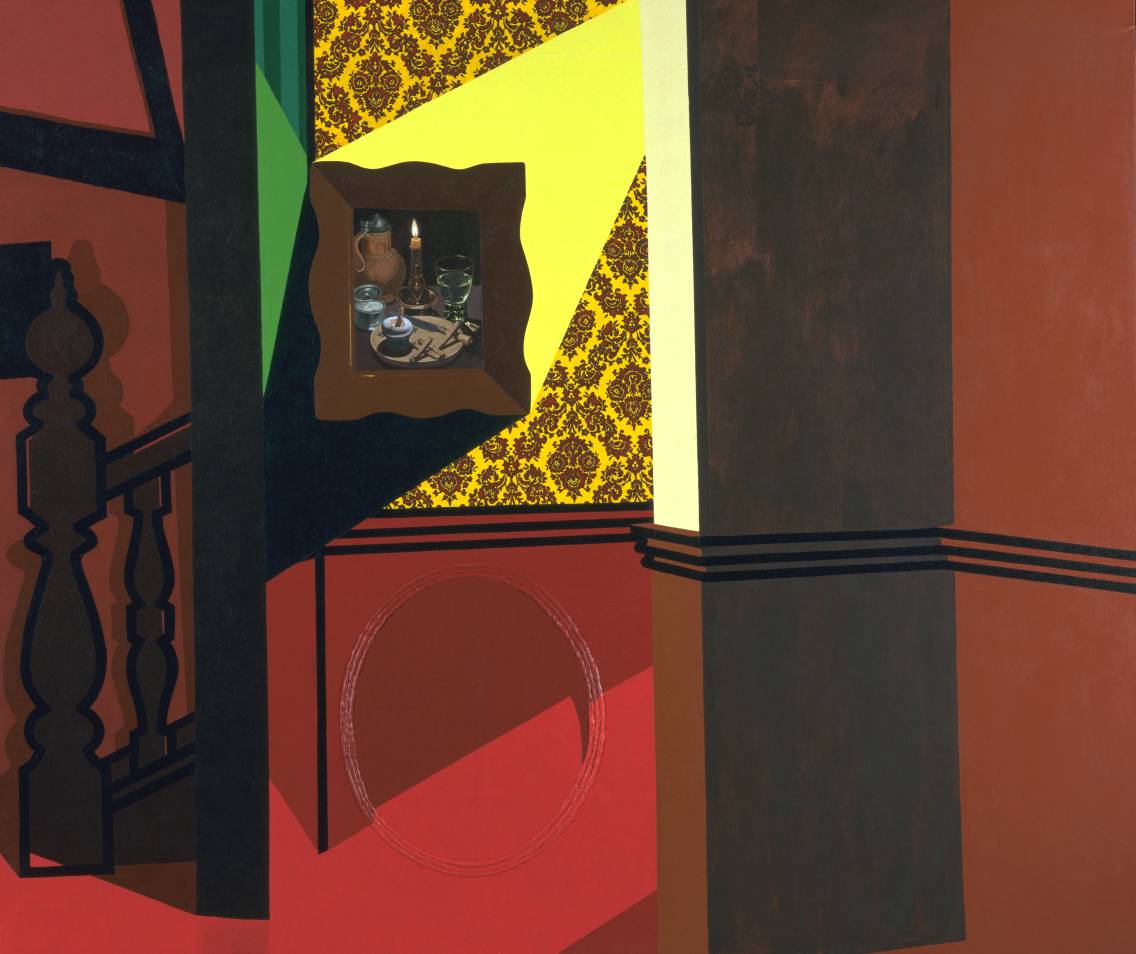
Patrick Caulfield
Interior with a Picture
Transcript
This image adheres to traditional pictorial perspective, so everything is portrayed as if seen from a single viewpoint. The space appears to recedes from us as it would if were three-dimensional and a correct sense of proportion is maintained between all the various elements.
This physical coherence makes us feel as if we could walk into and around the space in the picture. All of the architectural features are given strong black outlines and the rigorous perspective is further emphasised by the dado rail that snakes around the walls. The rail serves to articulate the intersection of the various walls and the different stages of depth within the picture. The strong vertical and horizontal lines created by the walls, staircase, dado rail and still life picture frame, lend a stable, grid-like structure to the composition onto which more complex patterns can be laid.
Although there is no source of light depicted in the painting, Caulfield has painted two strong directional shafts of light in the right hand corridor. They are painted without any modulation so their colour is absolutely flat and unbroken. However, the wide strip that cuts diagonally across the dark red wall, spilling out into the landing area can be read as an indication of a light source further down the corridor. It also serves to illuminate a curious oval moulding below the dado rail and the still life painting.
Caulfield describes the three ridges of the dado rail extremely simply by reducing them to three strong black horizontal lines. But he switches his pictorial language dramatically to describe the oval moulding, using delicate highlights and shadows to give a highly realistic impression of it being raised above the picture surface.
Where the light catches the tops of the ridges, the red of the wall is at its lightest, and so conversely it darkens considerably to describe the shadowy recesses. The path of the light as it travels down the corridor is slightly distorted as it goes up, across and over these ridges, demonstrating the shallowness of the moulding.
The second light source is more powerful. It comes from the right of a framed still life painting above the dado rail, directing itself at the image like a vivid yellow searchlight and eliminating the wallpaper pattern in its path. It fixes itself to the top right and bottom left corners of the picture's frame, but its source, seemingly coming from a height further down the corridor, is unseen.
Corresponding directly to this bright light is an inky black shadow cast by the frame of the painting. This shadow points downwards and to the left of the still life, stopping where the wall turns away towards the staircase. In reality, the shadow is exaggerated and could only be explained in naturalistic terms if the frame of the still life were very deep and standing proud of the wall. However, in relation to the shape and intensity of the beam of light opposite, and the logic of the image as a whole, it makes emotional and structural sense.
Together, the two shafts of light from the corridor suggest that the softer red near the bottom of the wall is daylight coming through an unseen window, while the harsher yellow beam of light is electric and possibly a spotlight pointed at the still life.
The brightness of the right hand corridor is in strong contrast to the relative darkness of the two thirds of the canvas on either side. As the intensity of the light reaching these areas diminishes, so the colours darken. The thin vertical edge that forms the end of the right hand corridor wall nearest us catches some residual light from the corridor. However, being weaker, this light has transformed the strong lemon of the wallpaper into a flat, pale sherbet colour, while the strong red below the dado rail has become a chestnut brown.
In the area immediately to the viewers' right the light is weaker still. The wall is neither yellow nor red, but an orange-brown. Ninety degrees to the left is the darkest area of all. It is painted deep chocolate colour as the wall is turned away from the light and in total shadow.
On the other side of the illuminated corridor is the area at the base of the staircase. This too is in relative shadow. Caulfield has depicted the faint shadows thrown by the turned wood of the newel post and banister against the wall behind them, and has picked out a few highlights on their curved edges. The shadows here are made softer by contrasting less in colour to the surfaces on which they fall. They are however, very precisely drawn when in reality the reduced light might make them rather fuzzy. The back wall behind the staircase is a darker, but slightly softer red than that used in the corridor, while the shadows cast upon it are a warm brown colour, complementing the darker chocolate brown of the wooden staircase itself.
Above the staircase two cross beams are set into the plasterwork of the wall and a dark rectangle hovers directly behind the top of the newel post. Since it is hangs at approximately the same height as the framed still life in the corridor, the suggestion is that this is another picture.
Amongst this radically simplified architecture, two areas stand out for their detail. These are the wallpaper and the still life painting hanging over it. The design of the wallpaper is very bold and heavy, with a large repeating diamond pattern of stylized red flowers hanging between arabesques of red foliage on a lemon yellow background. It is reminiscent of traditional Victorian flock prints and the type of wallpaper often favoured by old fashioned hotels.
The still life picture is a copy of a painting called 'Meal By Candlelight' by the seventeenth-century German artist Gottfried von Wedig. In the centre of this dark painting is a lighted candle. It sits in a brass candlestick and has burnt so low that the final few centimetres of wax glow golden against the dark background. Continuing anti-clockwise around the candle, there is a terracotta water jug with a metal lid filling the top left area of the picture. In front of it is a small metal container, possibly pewter, whose single hinged lid is opened towards us. It looks like it might contain salt. In front of the candle and filling the bottom of the picture is a circular wooden chopping board. Sitting on top of it is an egg in an eggcup, unusually cracked open in the middle rather than at the top. A solider of bread or toast is dipped into the egg, and another four lie on the board next to a knife. Finally, behind the board and to the right of the candle is a green water glass with smooth sides and a short knobbly stem, two thirds filled with water.
It is a typical Northern European, seventeenth century painting, laden with precise detail and startling in its naturalism. Particularly notable here is the artist's skill in portraying the play of candle light over different surface textures; pottery, glass, wood, wax, matt and shiny metal. In still life paintings such as this, the objects also carried symbolic meanings. Most obviously, a candle was used to represent the brevity of a person's existence and in von Wedig’s painting, the imminence of death is emphasised by how little life is left in the candle.
By coping von Wedig’s painting exactly, Caulfield makes it appear to be a photographic reproduction of the original. Consequently, within the context of Caulfield’s image, the still life painting appears more ‘real’ than the environment that contains it, which has been painted in an openly representational style that completely contradicts von Wedig’s realism. By simultaneously illustrating two different techniques for portraying ‘reality’ on canvas, Caulfield highlights the artificiality of both.
The source of light in von Wedig’s still life is obvious, but its effect on the objects around it is a gentle one. This is a playful contrast to the bold but mysterious light sources that exist elsewhere in the painting.
The turquoise blues and greens of the eggcup, metal and glass in von Wedig’s picture help to animate reds that dominate the rest of Caulfield’s canvas. These blues and greens are the complementary colours of the reds. When complementary colours are put together they appear more vibrant. Though proportionally small within the work as a whole, the colours in the still life painting have a significant bearing on the intensity of the work overall.
Caulfield has further emphasised this optical effect by including a single passage of paint that is entirely abstract and impossible to read in naturalistic terms. It is immediately to the left of the still life painting at the very end of the facing corridor wall. Caulfield has painted two thin geometric patches, one of emerald green and another of conifer green stripes. They seem to serve no other purpose than to provide a counterbalance to the dominant reds in the painting. Caulfield explained elements such as these by saying; ‘The spaces and interiors we see in real life are always more surprising than those we could invent. Since one can’t actually compete with the unexpectedness of reality, I feel free to invent any contortions of space as long as they work for me. At the same time I don’t want to do something which is so artificial that it becomes surrealism. I want it to have some link with reality.’
In this painting, Caulfield wittily explores different conventions for representing reality, simultaneously convincing the viewer of his scene’s veracity whilst revealing how the illusion is constructed. This interest in the nature of representation and the boundaries between abstraction and naturalism remained constant throughout his career. Although his subject matter developed in complexity and sophistication, his bold, colourful and simplified signature painting style and visual wit stayed constant and marked him out from many of his Pop Art contemporaries.